
Two Inescapable Thoughts about the Next Dallas Stars Jerseys
Or "sweaters," if we're being technical

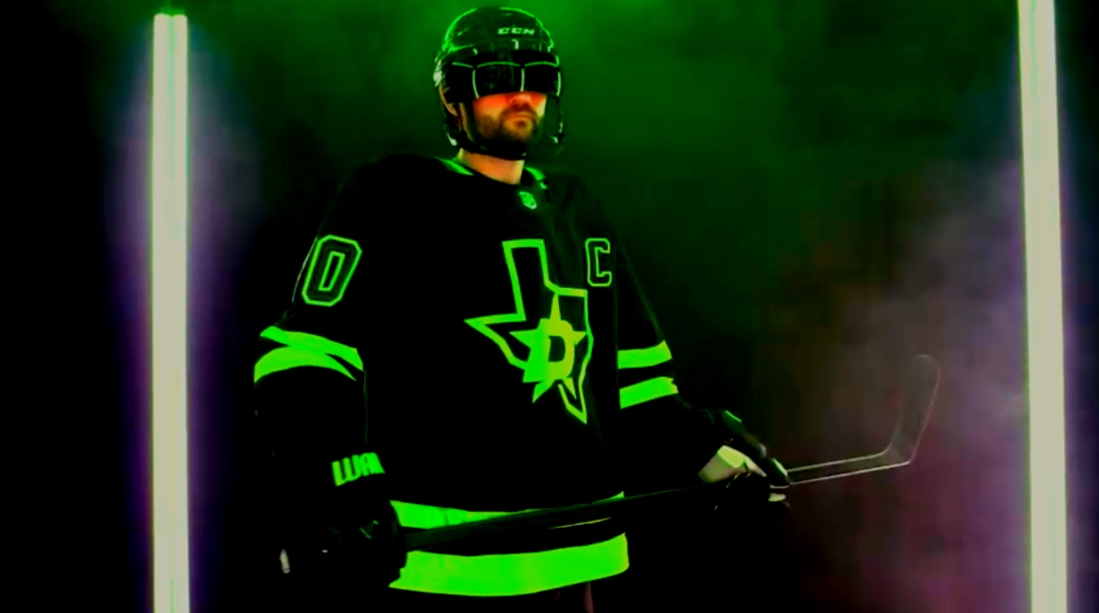
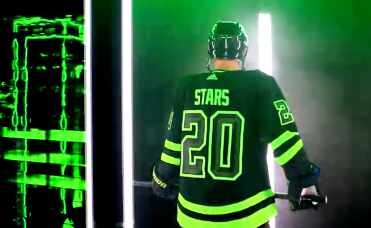
By all indications, the old Dallas Stars Blackout alternate jerseys have run their course after five years.
Since debuting in the shortened 2020-21 season, the Skyline Green sweaters have been worn for 53 games. But with a reduced run of just seven games in the 2024-25 season along with heavy markdowns in team stores late in the year, the Blackouts look like they’ll be making way for something new.
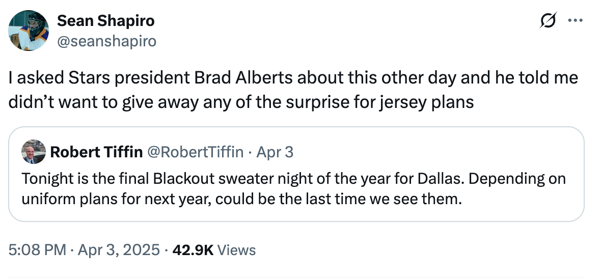
To be clear, we still don’t have confirmation of what that new “something” will be. As a rule, the Stars prefer to keep big reveals like this quiet ahead of time in order to preserve the element of surprise, as we were reminded back in April.
The likely disappearance of the alternate sweaters is a shame on the one hand, because the Blackouts were basically the perfect alternate jersey. In my obviously correct opinion, the primary goal of any third sweater is to be fully distinct from the team’s usual sweaters (i.e. the opposite idea of the laughable “third” jerseys of 2010, which you could easily watch for an entire game without realizing anything was different), and they were certainly that.
But while being distinct is easy enough (as Wild Wing can testify), the ideal way to do so is by retaining consistent branding themes that connect to the team and its city. You want different, but you also want it to make sense.
This is where the Blackout design crushed it, I think. By evoking the Bank of America Plaza lights and using the Texas state outline on the main crest, the jersey feels just about as “Dallas” and #texashockey as you could ask of a team playing in the city of my birth. And if you’re wondering why I just hit you over the noggin with a jarring reference to my birth, it’s because being from here implicitly legitimizes my criticism of Dallas. I go here, I can be mean. Them’s the rules.
Dallas is a hard city to evoke with one simple design. In general, it’s a place that fits within that category of prairie cities saddled with parking lot sprawl1 rather than walkability. You basically have to have a car if you’re here for more than a day, and even that is just so you can get to the good restaurants without getting run over due to chronic lack of sidewalks.
This might be the point where you’re tempted to appropriate Gertrude Stein’s “there’s no there, there” phrase, but remember that was 1. More about nostalgia than anything, and 2. About Oakland—a place that for all its warts still makes for pretty gorgeous drone footage, at the very least.2
Dallas, though? Well, it’s a good thing there isn’t terribly much to gawk at if you’re driving downtown, because we really don’t recommend convertibles here.
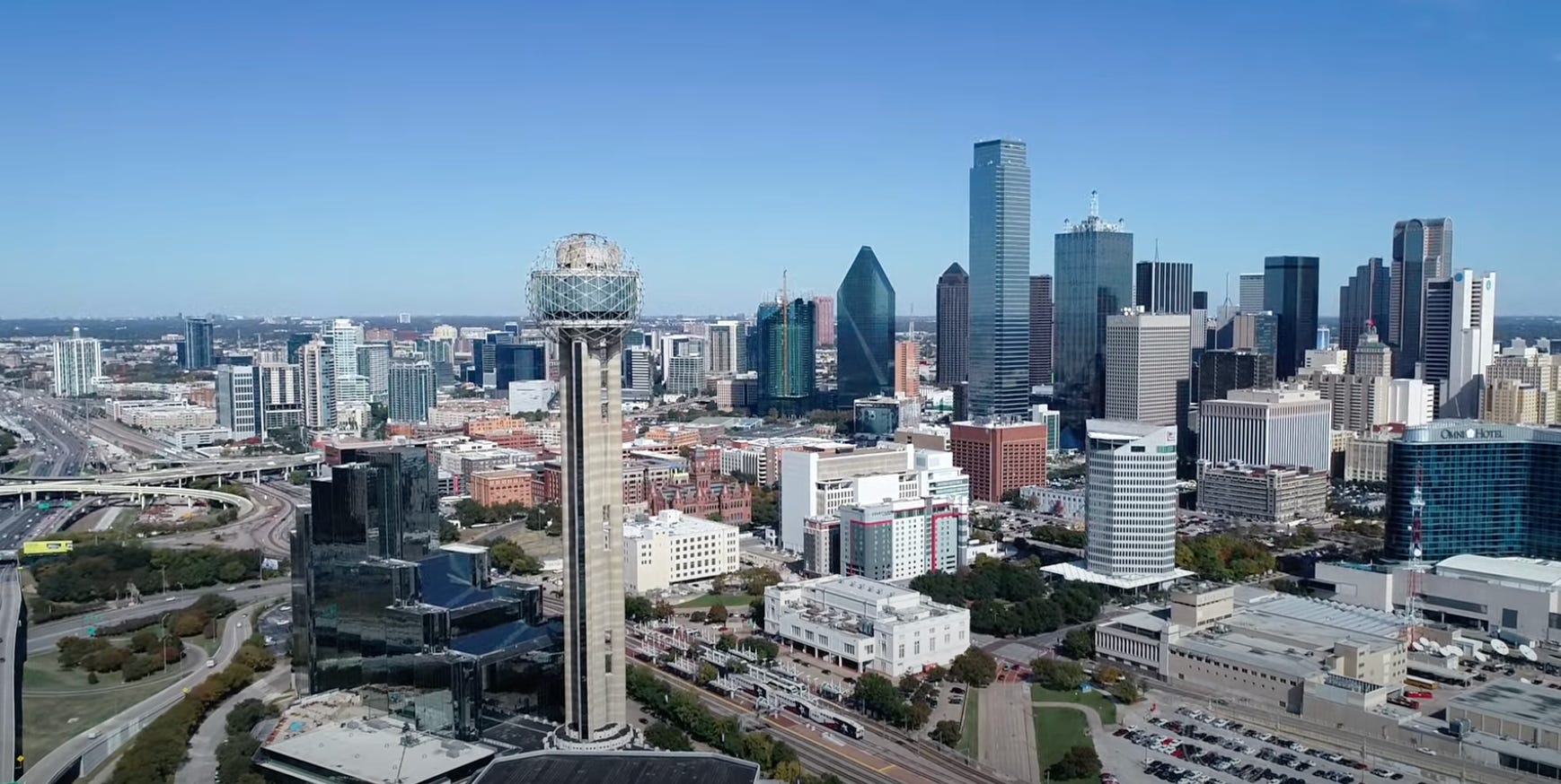
I guess what I’m saying is: Dallas is a city that looks its best when the lights are low.
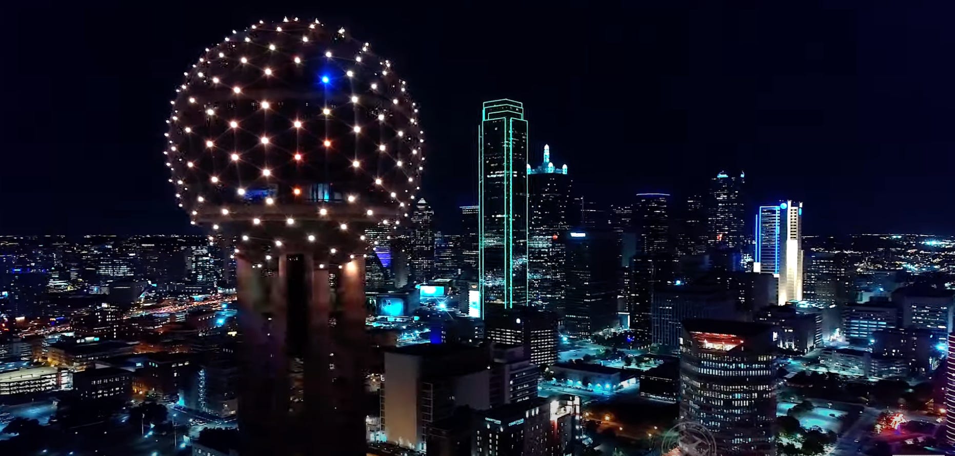
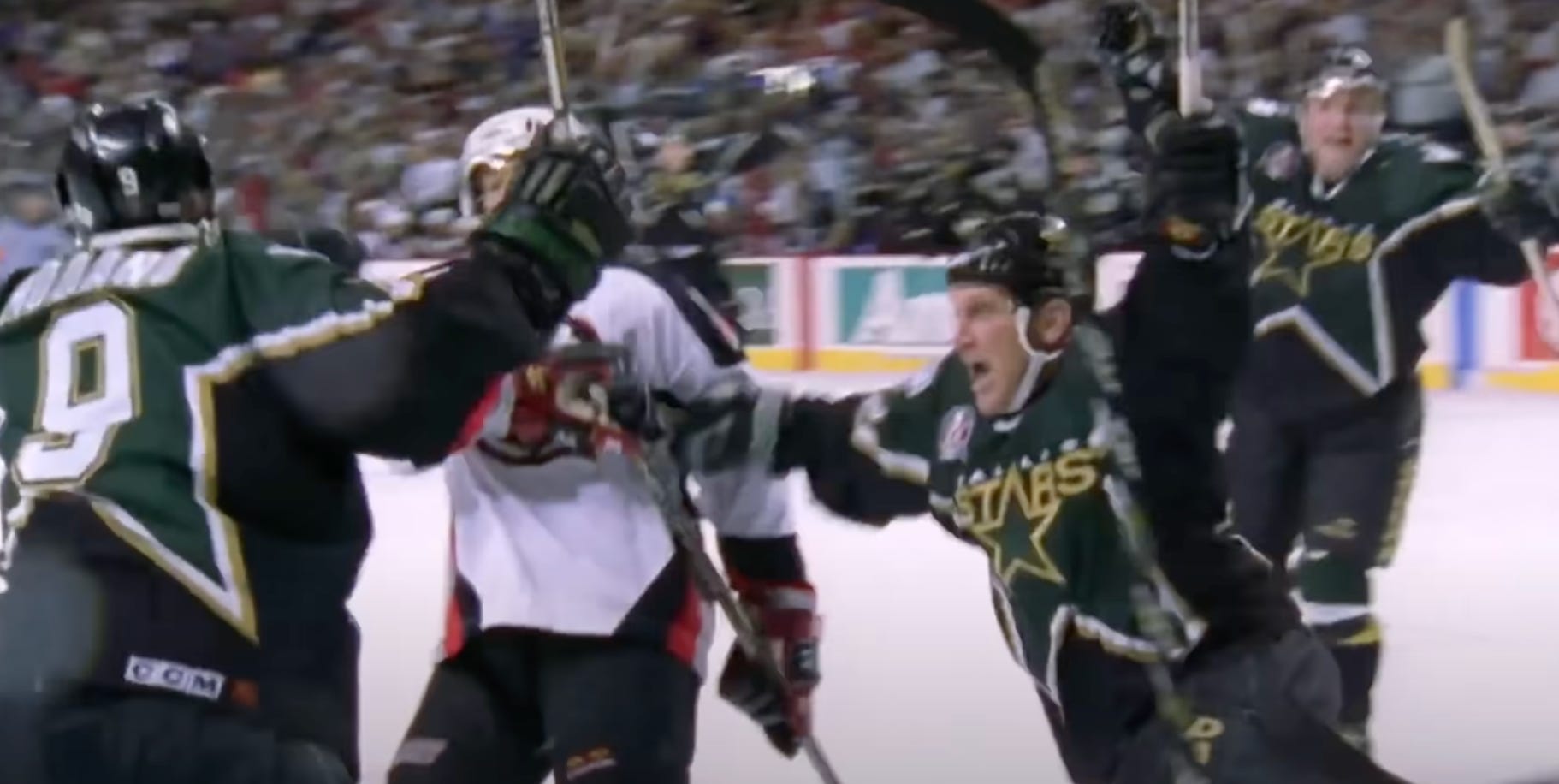
And with that as a given, the Blackouts manage to capture something both local and all-encompassing. Sure, their brash design wasn’t for everyone, but there’s a reason they stuck around for half a decade. They set a high bar for breaking the mold, and whether there’s a new jersey coming this season or down the road, expectations have entirely rebounded from another third jersey that launched a couple decades ago whose name escapes me for some reason. Ah well, probably nobody remembers that one.
As for what’s next, I keep coming back to two things about future Dallas Stars sweaters that just seem inevitable. One of them is speculative, and one is more deductive.
Let’s start with the one that will make you happy.
1. Stars Fans Love Their History
Given the opportunity, Stars fans tend to gravitate toward callbacks and retro jerseys. In fact, the whole NHL kinda does, hence the now-discontinued Reverse Retro program that saw two “reimagined” Stars designs return over the past few years for limited runs.
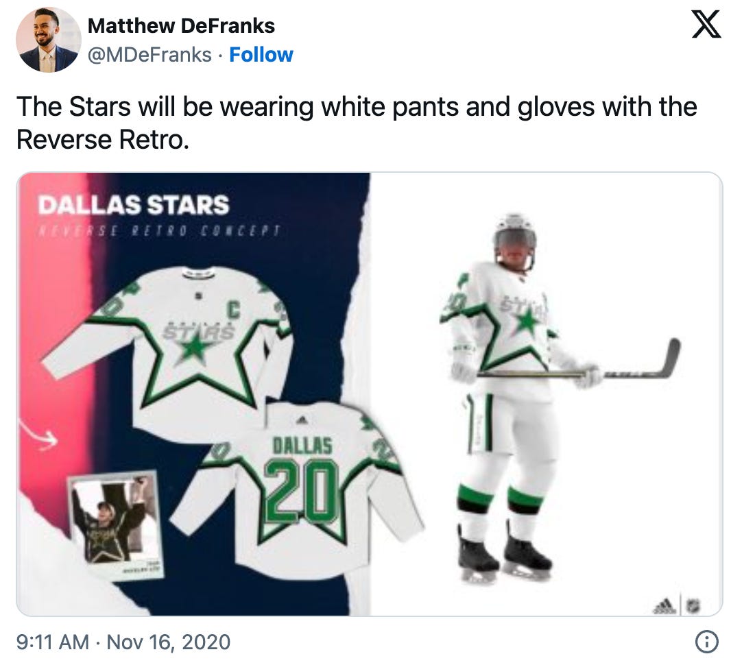
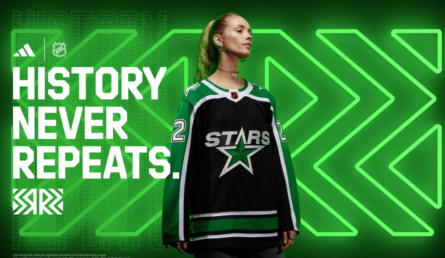
It’s no secret that the darker 2022 Reverse Retros were received far more positively than the white “stormtrooper” sweaters, and I think there are two big reasons for that: the lack of contrasting colors above and below the star outline (why on earth wouldn’t you add more green?), and the fact that the white sweaters debuted in the same season as the far more attractive Blackouts.
On a less sartorial level, the team was pretty bad in 2020-21, missing the playoffs in a season that is best forgotten by everyone except the Montreal Canadiens3. That probably didn’t help the monochromatic look win anyone over, either. In contrast, the 2022 Reverse Retros debuted when the Stars began tearing up the Central Division, with Jason Robertson in particular setting Dallas scoring records that year. Good memories beget fond ones, after all.
But even outside of league-mandated nostalgia, this franchise has never shied away from the deep connection fans have to the salad days of 1999. From wearing matching Modano or Zubov warmup jerseys to sporting Jere Lehtinen’s golden laces during a winning streak, the team has always known how much fans love the look they were wearing when they won the Stanley Cup—a design appropriated from the league’s All-Star sweaters earlier in the decade, in case you didn’t know.
So, for my money, I can’t imagine that their next alternate sweaters wouldn’t take into the account their fans’ love for the 1999 design and the high praise for the 2022-23 Reverse Retros while also trying to fix the obvious sins of the white versions of the 1999 design.
The star design is just too distinctive and beloved not to factor into those sorts of conversation, I’d think. If they can find a way to make it pop as much as the Blackouts did, then the Stars could find themselves with another stunning sweater.
(Also, to be real for a minute: the old golden wordmark looks really dated, and not in a “classic” way. Fix that.)
Lastly, here’s the other, less fun thing that seems inevitable about the next sweaters Dallas is likely to be wearing.
2. Jersey Ads Are Coming
Since the NHL decided to sell out its sweaters for ad revenue in 2022-23, the Dallas Stars have remained one of the few remaining teams without a jersey ad.
I expect that to change any day now.
It’s not a matter of principle for the organization or anything like that, just in case you’ve been holding out hope that Dallas will refrain from cashing in on the NHL-allotted jersey patch. From conversations with multiple people in and around the organization, my understanding is that the team simply hasn’t found the right jersey sponsor, which is another way of saying they haven’t caved on their asking price. But with the organization’s growth and the team’s continued success on the ice, one would think that real estate will be purchased before too long.
For the record: this isn’t an indictment of the team, at least not more than any other. If anything, you could probably commend the Stars for holding off on sullying the sweater for as long as they have. Stars fans had a few more years than most NHL fans did without having to look at advertisements on top of their beloved sweater, and whatever the reason for holding off on it, it’s something most fans should be grateful for.
Really, this all goes back to the league’s decision to finally cave on allowing jersey ads in an effort to boost revenues after the pandemic. It was a really disappointing choice, even if it was bound to happen eventually, because once that genie got out of the bottle, it was never getting back in.
And suddenly the league is so flush with cash that escrow is all done with. Things are so good right now that players were willing to reduce their max contract terms and to agree to playing 84 regular season games once the new Collective Bargaining Agreement kicks in. Maybe the uniform sales saved the NHL, hooray! Or maybe the league was always going to rebound, and the cash infusion was just too tempting for most owners not to take the minute it was available.
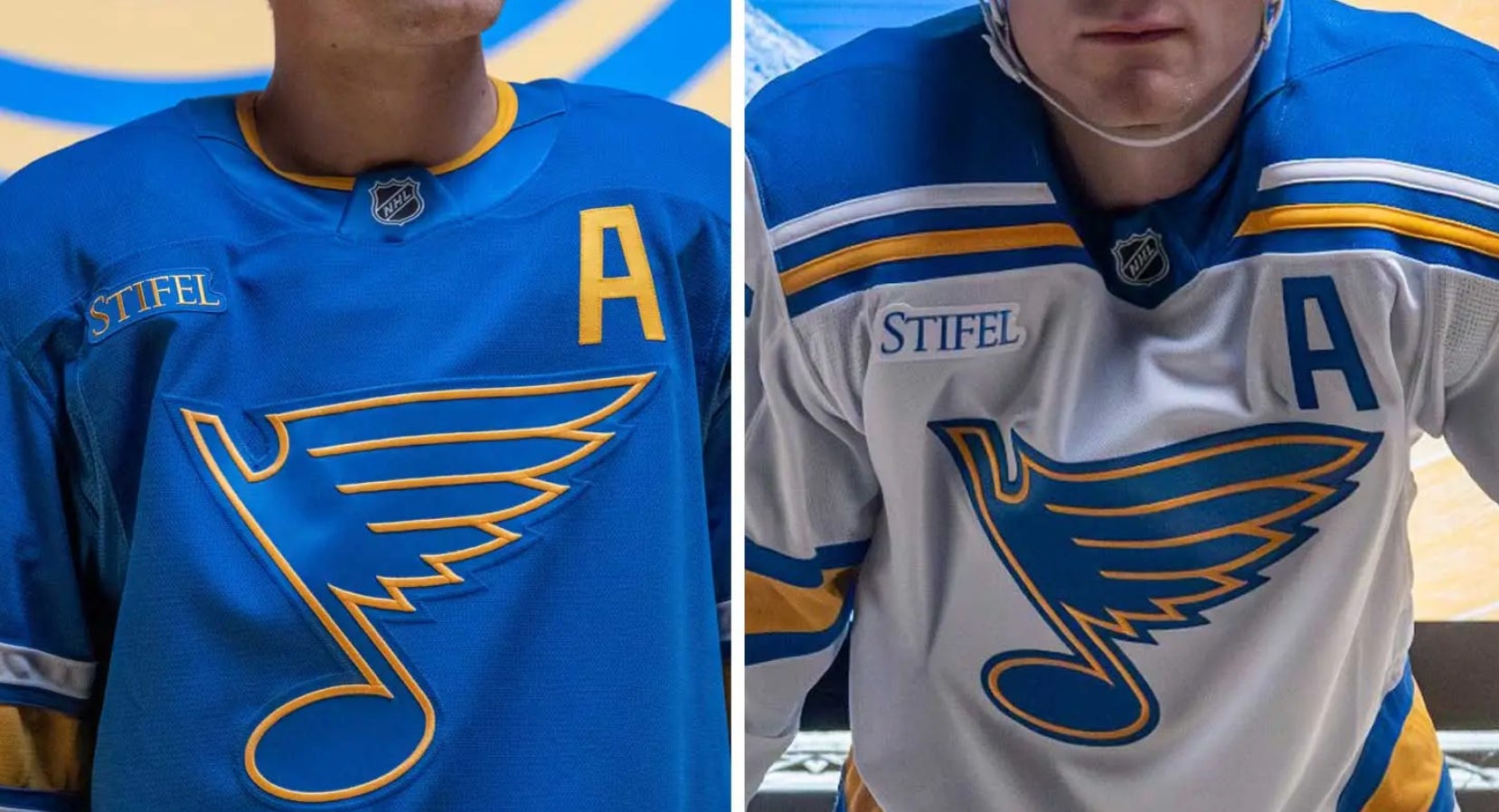
Take, for instance, a really beautiful update to the Blues’ sweaters this summer—marred with sponsorship, because money.
Now, let me just get ahead of you really quick: if jersey sponsorships increase revenue for teams, then that’s good for everyone, right? More hockey-related revenue means the cap goes up, and it means your team can afford more and better players. Don’t you want that? Or would you like your team to wear old-timey sweaters with no logos as they get skated out of the building by richer teams with more talent? Is that what you want, you walking, talking anachronism of a writer, huh?
Well, first of all, yes. Sports are more fun when you don’t care about winning at the expense of everything else, because then you can delude yourself into thinking that “your” team’s victories are the universe’s moral vindication for your fandom. And even if your team doesn’t win, you still get to be the hockey equivalent Bills fan, which makes you a very sympathetic figure who gets invited to parties to make other people feel less bad about themselves. Cool, right?
Also, I tend to subscribe to the very sexy idea that most advertising is bad for us as people. (Hence the last two iterations of Stars Thoughts, where the only ads you’ll see are the self-referential ones.)
Yeah, I get it, we live in a society, how dare you Robert, you can’t expect teams to leave money on the table, and so on. Once I disperse the angry mobs around my house, I’ll have time to explain myself. Or, I dunno, I guess you can read a really lame way of expressing this opinion, if you’d rather.
I’m not naïve. For goodness’ sake, the NHL moved their crest from the bottom hem to the throat a couple decades ago just to ensure you couldn’t look at a single player’s face without the league’s branding getting in there, too. Advertisements are nothing novel, and pretending that we’re preserving some illusion of purity if we keep ads off jerseys is just that: pretending.
But whether they’re painted under the ice, on the boards, or projected onto them digitally, the goal of ads is the same in hockey: to get you thinking about something other than hockey. And jersey ads are and will continue to do the same thing, as they have been doing for most of the franchises around the league now.
But man, it’s just a shame that every photo after the onset of Dallas Stars jersey ads—whenever they arrive—will also feature a blunt reminder of just how much of their game the league is willing to sell in order to profit off a game that seeks to evoke romance and history in equal measure.
So, enjoy those (relatively) pristine sweaters while you have them. Because they probably won’t be there much longer.
Fan fact: 25% of downtown Dallas is parking lots.
Look, the Bay Area has a ton of natural beauty, but let’s not kid ourselves here: Oakland is just Denton with a few more trees.
Nashville just did beat out Dallas for the last playoff spot in the division that year, and perhaps that was the worst thing that could have happened to the Predators, who spent five straight years finishing 4th or 5th in their division from 2019 to 2024. Barry Trotz then got sick of that mediocrity and went on a free agent bonanza last summer in an effort to catapult them back into contention. They finished 7th.
I personally think the blackout jersey is (was) the best jersey in the entire league. The neon was so bold, nobody else doing it, which is a big part of why its so awesome. I would love them to make it their "standard" home jersey. I can dream can't I????? For the new jerseys, I have only one hope and that is that they do NOT dare bring in f***ing Cowboy blue. DON'T DO IT!!!!
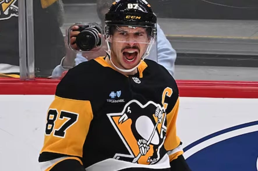
I'm not sure this was intentional; but, the juxtaposition of the Pittsburgh pictures where I see way more ads in the "pristine" jersey picture (Jofa, CCM, Rawlings, & Koho) versus the Crosby picture (CCM & BCBS) was pretty funny. You either didn't mean it or you've seen those equipment logos so much your brain doesn't even notice the ads. It gives you something to think about.